JOBBER MOBILE APP
Core Workflow Redesign
Streamlining operations for fieldworkers through a faster, more clear and intuitive visit workflow in the Jobber app.
Project Details
Role: Lead Product Designer
Product: Jobber, 2022
Problem
Visit workflows were inconsistent across mobile and web, causing user confusion for fieldworkers and extra clicks
Team: PM, Dev, Design
Goal
Redesign the core Visit experience for fieldworkers to improve clarity, reduce friction, and improve speed during field visits.
Tools: Figma, Figjam
Impact
Simplified Visit workflows and improved time-to-completion metrics by 25%.
Background & Context
As part of a company-wide initiative, Jobber undertook a significant redesign of its mobile app to modernize the user experience and upgrade its aging technology stack.
This redesign spanned multiple teams across the product organization and required an extensive overhaul of core workflows–some of which hadn’t been updated in over five years.
My product team–responsible for the Visits part of the app (used by fieldworkers)–leveraged Jakob Nielsen’s 10 Usability Heuristics for User Interface Design to guide usability improvements and ensure an intuitive experience.
Solving Friction for Fieldworkers
The “Visits” section of Jobber’s mobile app is critical for fieldworkers who manage day-to-day operations in the field. Before this redesign, it had a UX heuristic score of 28/100, exposing major workflow friction and usability gaps.
By leveraging a UX Heuristics audit, I identified key pain points: unclear system status, throughout the visit flow, confusing messaging language, inefficiencies and limitations in editing visits, and poor error recovery. These issues eroded trust, slowed fieldwork, and created workflow breakdowns in front of customers. They also affected the UX Heuristics for flexibility and efficiency of use, visibility of system status and recognition rather than recall. These issues included:
Disabled line items at the visit level which blocked fieldworkers from making changes to then job when they were on-site and resulted in confusion and customer trust breakdown.
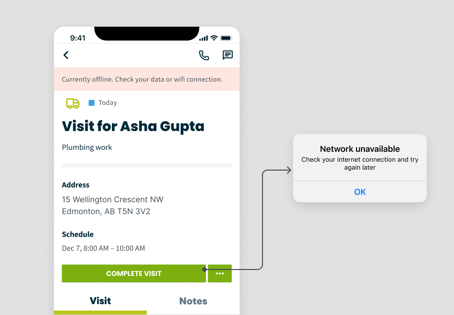
Error messaging was either completely missing from the visit workflow in the app (even though it was visible on Jobber desktop) or the error messaging lacked information for the fieldworker to let them know how to make address errors.
There were dead-end workflows both in the desktop and app visits flow. For example, fieldworkers could change the line item quantity for recurring jobs (field was enabled) even though the pricing would not be affected and invoice would not reflect these changes (recurring jobs had to have line items changed at the job level).
UX Issue #1: we allowed customers to edit the name, description, quantity and price of existing line items across the visit flow. We enabled customers to edit and add new line items for both recurring and one-off jobs. This change improved the UX heuristics score for Flexibility and Efficiency of Use.
UX Issue #2: We ensured there was clear, consistent language on all warning banners across visit workflows. This improved the UX heuristic score for Visibility of System Status.
UX Issue #3: We restricted app users from entering this dead-end workflow by disabling ability to edit line item and included clear messaging explaining why and how to address these changes
Grounding our redesign in usability heuristics gave us a framework to turn a 28/100 problem area into one of the most reliable, high-traffic parts of the app.
Our redesign focused on improving clarity, flexibility, and reliability—enabling fieldworkers to complete visits smoothly, stay aligned with clients, and recover quickly from errors. This significantly improved usability for one of the most sensitive and high-traffic areas of the app. The evaluation highlighted critical gaps and guided us toward creating a more intuitive, consumer-grade experience.
Once improvements were in place, we re-scored the workflows and tested with real users, validating progress and surfacing any remaining friction.This structured approach allowed us to measure tangible UX gains, build stakeholder confidence, and ensure that improvements directly addressed real-world fieldworker needs.
System Mapping to Simplify Workflows
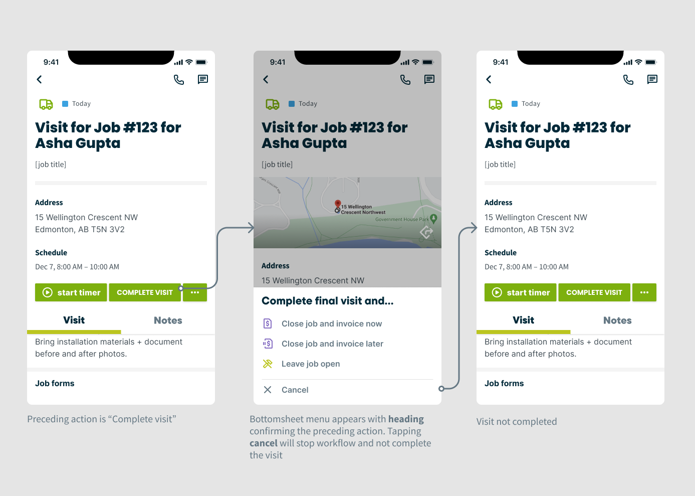
As part of our broader redesign efforts, I also partnered closely with my Product Manager to simplify one of the most frequent and critical workflows in the app: marking a visit complete. The original flow presented users with seven different completion outcomes once they marked a visit as complete. This resulted in cognitive overload, redundant steps, and inconsistent terminology.
I worked on reducing friction and improving clarity through task simplification by focusing on three key areas–mapping out the different key actions and outcomes which resulted in these actions and figuring out where there were unnecessary or extra steps and friction where there were opportunities to could consolidate workflows.
This mapping exercise resulted in three key improvements:
We consolidated seven outcomes into three clear paths – significantly reducing decision fatigue.
We eliminated redundant and unclear language. This improved user comprehesion and task confidence.
We surfaced key actions within the main visit view in order to increase visibility of available actions and reduce navigation time.
“I LOVE the simplified visit completion flow to ask basically if the work is done or not instead of putting the job into various statuses (eg.on-hold, invoice later, action required). I freakin’ love it! You are speaking my language now!”
Re-evaluating Visits UX Heuristics
We re-evaluated the redesigned “Visits” workflows using Jakob Nielsen’s Usability Heuristics. The result: a jump from 28% to 72% in heuristic score.
Our UX Heuristic score jumped from 28% to 72%, validating major usability gains.
Because features were rolled out gradually to Beta users, we paired this evaluation with usability interviews to validate design patterns, uncover friction points, and refine before full release. This process gave us measurable proof of progress and ensured cross-team alignment on usability standards.
Usability Testing
To further validate the new Visits experience and our overall design changes, I built an interactive prototype and ran usability sessions with 5 customers and 2 internal users. Participants included owner-operators and fieldworkers from companies with 20+ employees, a mix of new and experienced Jobber users, and industries ranging from lighting installation to landscape maintenance.
Sessions were recorded and reviewed for accuracy, with findings organized in a FigJam board: green, red, and orange markers indicated task success, failure, or friction; blue notes captured key learning opportunities for future iterations. Together with my PM and lead engineer, I led research planning to define assumptions, prioritize workflows, and set success metrics. We focused testing on:
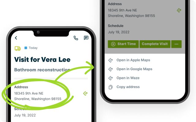
Discoverability of relocated actions (e.g., directions to a property was moved during re-design)
Intuitiveness of sending the new “On My Way” text (which was re-designed as part of migration to new React code)
Effectiveness of the newly simplified “Mark Visit Complete” flows
Success was measured by Time on Task as well as task completion rates.
Above: Prototype used to test with customers. Tasks have been outlined in the left hand column.
Above: Figjam board with related notes from usability tests. Notes are separated by opportunities, successes, friction points, failures.
Testing Outcomes & Insights
We tracked task completion during usability testing to measure the effectiveness of the redesigned Visits feature. This quickly surfaced usability wins and pain points ahead of launch.
Key Successes
Identifying and grouping information
Starting a timer and completing a visit
Completing visit workflows smoothly
Retrieving directions (mostly successful)
Key Challenges:
Sending an “On My Way” text
Editing the visit schedule
Emailing a job form
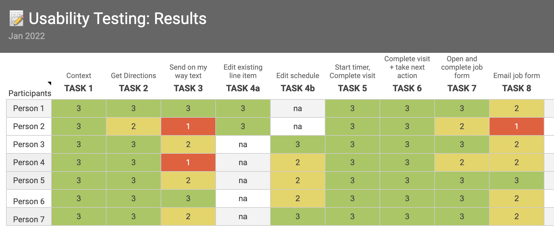
Image: Worksheet used to track testing outcomes per task
User testing revealed friction in messaging and scheduling workflows–directly informing design refinements and adjusting our phase one release.
While layout and prioritization tested well, participants struggled with redundancy in the schedule display and misunderstood the “On My Way” messaging flow, expecting a one-tap quick action. They also needed clearer cues when retrieving directions. These insights informed design refinements to improve task efficiency, reduce confusion, and deliver a more intuitive experience.
I partnered with my PM and tech lead to synthesize findings, define next steps, and align priorities with stakeholders. Based on the feedback and failure data, we prioritized relocating and redesigning the “On My Way” feature as a critical improvement ahead of release.
Design System Improvements
I partnered with the design system team to turn project work into scalable, reusable components that supported multiple product areas. Key updates included refining the BottomSheet component and creating Interaction guidelines for offline messaging.
These enhancements were adopted across other product teams responsible for Jobs, Quotes, and Invoicing–driving greater consistency, usability, and speed of implementation. These components also reduced design debt across
Jobber’s mobile app.
Impact & Takeaways
Through a UX heuristics audit, user testing, and design system enhancements, I led improvements to Visits that delivered measurable gains in usability and efficiency.
Key outcomes:
Improved task clarity: Real-time user feedback when editing line items through appropriate messaging and more flexibility eliminated uncertainty and reduced errors for fieldworkers.
Reduced user confusion: Standardized workflows, and visuals across Visits and Jobs built trust and consistency.
Lower cognitive load: Contextually surfacing key information at the appropriate points during a site visit helped fieldworkers complete tasks faster and with less effort.
Increased efficiency: Quick editing, rapid addition of line items, and shortcuts for frequent visit workflows streamlined high-volume tasks.
A major focus was improving line-item editing at the visit level–a critical on-site task for fieldworkers. By optimizing this workflow, we not only increased speed and accuracy but also strengthened client trust at the earliest stage of engagement. These improvements empowered fieldworkers to spend less time in the app and more time building relationships, directly contributing to repeat business and new lead generation.